From conducting ethnographic research, to encoding behaviors into an architectural master plan, to building business and business alignment through digital transformation and Service Design, designing organization with SACU has been an amazing venture.
Step 1 -
community master plan
derivation of plan as key frames
north elevation sketch and detail
After observation and documentation, the community plan was designed to realize sustainable programatic goals across cultural, environmental and economic dimensions, however, the economic component of the plan was functionally underdeveloped.
Work accomplished in collaboration with Professional Engineer Christi Fragale.
Step 2A -
economic sustainability
product development
I prototyped and modified the common paper bead jewelry SACU makes to create market differentiation and value in the American and Ugandan markets. I projected that the new contemporary design sold in an American market will generate more revenue per bead.
Step 2 began to fall apart as production logistics bore down on SACU’s leaders. The will to solve the problem and make it work was not there, and, without that, the social business failed. I was naive to overlook organizational politics, I had to learn that actionable strategies were those that got the right information to the right people, and transformational ones are those that are co-designed with stakeholders themselves.
Step 2B -
brand unity
The need for formal organizational documentation of a developed world standard was apparent, and so, before finishing the master plan, shown above, I began drafting a brand strategy on location.
The ebb and flow of donations called for a more stable strategy and a brand position that strikes more than one chord. I envisioned SACU as a brand that you loved contributing to, a brand you wore on your sleeve, something calmly broached, not solely because of their religious affiliation, but because they are with it and they care.
Organization Logo Design Fusion and Mediation
Since a shift in leadership in 2017, SACU Canada began organizing under their own updated logo, while the SACU on-site team used the original logo. This logo integration project was used to spark cross-team operational conversations around brand unity.
After negotiating the logo merge, the whole team was able to agree on one design that would serve both SACU’s Canadian Organizers and Uganda’s Site Team. The design honored the original Ugandan logo more heavily as the Ugandan partners were identified as being less resilient to a major brand image shift.
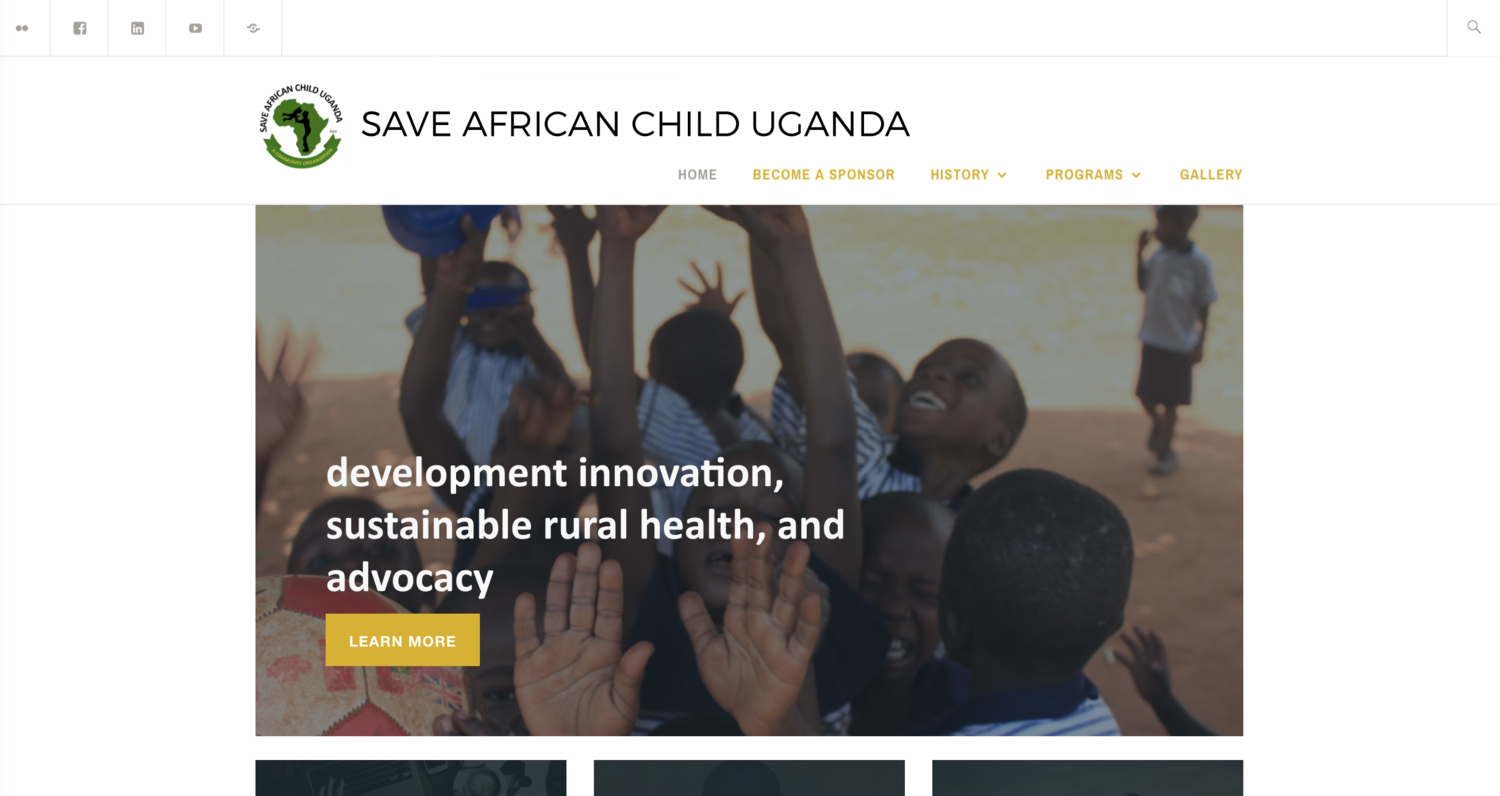
Website Overhaul
Guiding the team to jointly choose a website url was another such negotiation, eventually they chose something that would suit both of their Canadian and Ugandan bases, sacuganda.org
old landing page
I used a simple tagging architecture to streamline the content management experience. All the communication updates from the home page to, deeper, individual project pages are made from one wordpress posting tab. As the team works to become more technically proficient, the SACU Website will be tweaked by Elaine Johnson, Secretary & Communication.
SACU development’s road map has been drafted as a result of stakeholder input.
I salvaged the first (packaging) logo iteration as a graphic detail on the website.


